
How I Revamped My Living Room
A few months ago, I announced that I was updating my living room. Announcing that I am undertaking an update is not an uncommon occurrence - in fact, I have made this statement about various rooms in my house no less than five times this year - but I was particularly excited about this one. The living room is my favourite room in our home. It’s central to the house and originally, the outside wall would have been on the far edge of it. An extension in the 1930’s means that there’s a door at the opposite end that leads through to the dining room and bar. It’s bright and light with high ceilings, a large sash window and a big, original mantel, but my favourite thing about it is that it’s almost completely square.

The shutters I discovered behind the roller blinds. That were there all the time. Sometimes, I seriously wonder about my eyesight.
When we moved in to the house, there were plain white roller blinds on both the living room and sitting room windows. In every home we’ve been in, I’ve always used blinds rather than curtains so was perfectly happy with this situation - in my opinion, window frames can be one of the most attractive parts of a room so it’s nice to show them in all their glory. However, when I was updating the sitting room for Revamp Restyle Reveal, I removed the blind only to discover that the original shutters were not only there in the sides of the windows, but also intact and working.
It was an absolute bombshell. You may ask how I didn’t realise this before (seeing that this fact was staring me in the face for two years), but I have no answer to that question. Anyone who has original shutters, however, will know that they can be tools of torture - one wrong move and the bar comes down like a guillotine on unsuspecting fingers. There’s been times when Buddy has been almost wiped out by a unsecured shutter edge. Anyway, suffice to say that I was ecstatic about this discovery and when it came to redesigning the living room, it was an excellent starting point for my plans.

There is also, as I stated above, a large, ornate marble mantelpiece. It’s absolutely of it’s time (the house was built in 1759) so we’re pretty sure it’s original, with a black grate beneath. When I started planning the room, my idea was to have the chimney swept so that once again we could bring the warmth of a real fire into the space. I enthusiastically told my friend my plans, who immediately pointed out the fact that it was actually a dummy fireplace with no opening at the top, another fact I had been completely blind to during our time in the house. My dreams of toasting marshmallows and drinking mulled wine around our cosy, working fireplace went up in smoke (pun intended) and I realised I would have to get the look with grate candles instead. Thwarted.
So what else had to change? The main focus of any living room is, of course, the sofa. Three years ago, we bought two four seater grey tweed sofas from DFS. An excellent buy, they worked well with the decor at the time and had the added bonus of being unbelievably comfortable. Everyone loved them - the dog used them as a look out perch to bark hysterically at unsuspecting passing walkers, they were long enough for Joe to stretch out in full and the children could push empty crisp packets and caramel wafer wrappers down the back of the cushions without my knowledge.
However, they were grey. Steel grey. My plans for the newly designed room involved avoiding this colour at all costs - I’d been there, done that and I wanted a change. They had to go. I sold them within minutes for a tidy sum to my friend Pandora who rushed over with a trailer the next day and whisked them off to her house. Uproar ensued. My family were furious, a fact that wasn’t aided by Pandora sending comedy photographs of herself lying on the sofas to their mobile phones. Anyway, it was too late. They’d gone to Dunnington, never to return, their comfort only a distant memory. I could start again and I’m not going to lie, I was pretty damned excited about it.
So what did I do? Well, I did as per my mood board - I transformed it into a mid century, neutral desert, seventies inspired relaxation zone. Yes, this is an actual thing. I’ve made it up. This is how I did it.
Sorted Out The Lighting
So when we moved in, there were two wall lights either side of the television. They weren’t particularly attractive - in fact, they were one of the most abused items by followers on my Instagram account (rude) - but the main issue with them was that they were defunct; we never switched them on. I’m not a great one for wall lights, I’m more of a subtle lighting kind of girl, and they just weren’t soft enough. I didn’t love them, so off they came. The holes were patched up and repainted and the room immediately looked much better.
I was going for an American navajo, western stylie vibe and needed a super impact statement central light. As I said before, the ceilings are high so something small just wouldn’t cut the mustard. I’d worked with David Hunt Lighting before on my Revamp Restyle Reveal bedroom makeover and I knew that they had the perfect chandelier - an Antler bleached pendant light. They make the antlers themselves using casts in their factory (you can see the video of how they do it below). The style is timeless and I knew that it would be the ideal piece for the space. And it was. No one has since entered the room without commenting on it and it fits with the design of the room perfectly.
On our Styling Your Home workshops, we always say that a central light should look equally as good off as it does on and the Antler light has ticked every box. Love it.


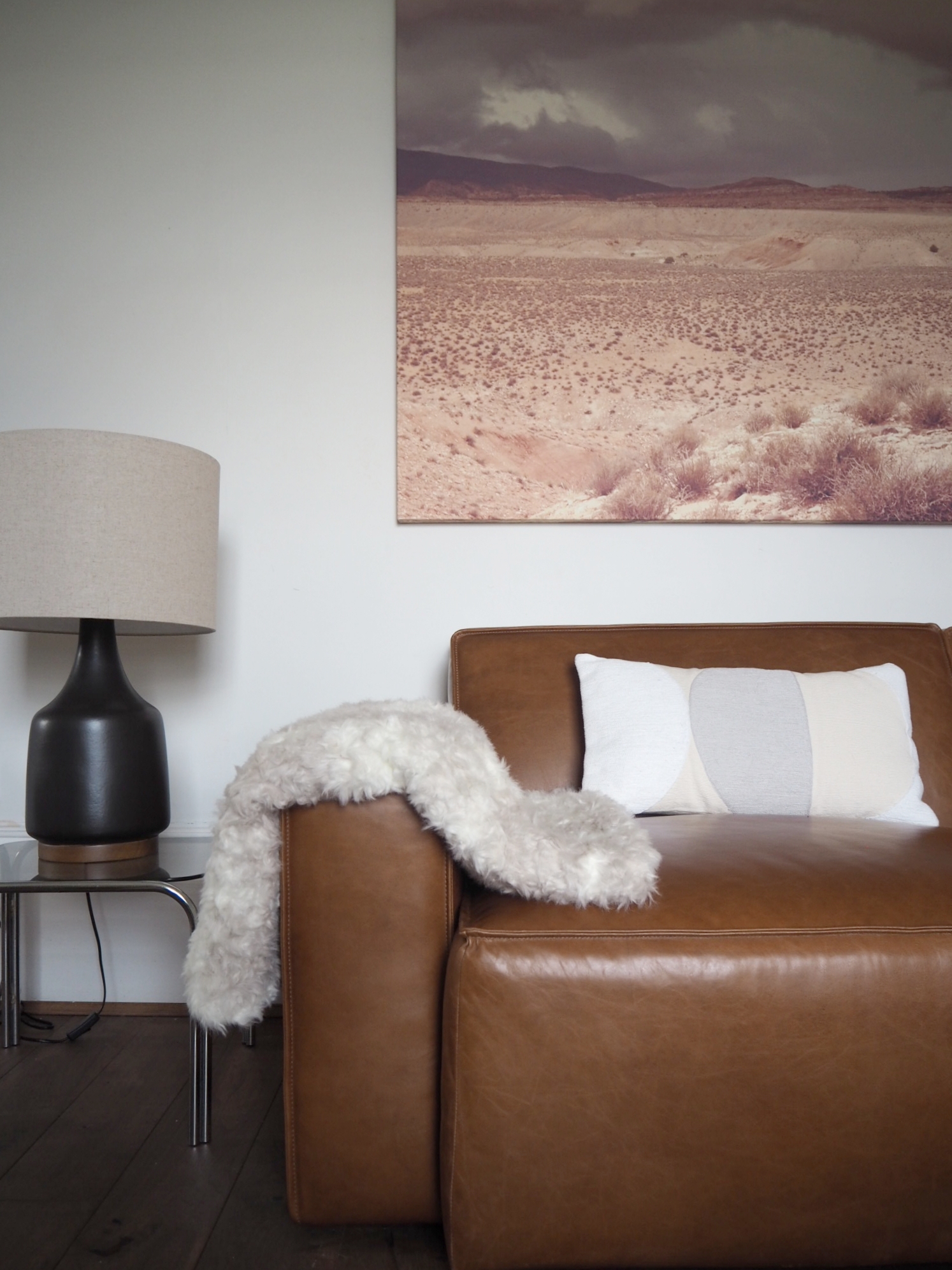
A room of this size needed at least four lamps so I picked the Morten table lamp from West Elm to place next to the sofa. The Modernist table lamp from West Elmlooked perfect in the opposite corner - both lamps fitted the style of the room perfectly and were tonal with the colour scheme. I already had a floor lamp from Argos Home in brass and a gold dome table lamp from Rockett St George that fitted well and remained in the room. Job done.
Repurposed Furniture
I kept a 1950’s bureau that I’d picked up years ago for £8 from the Sue Ryder Sale Of Unwanted Goods (an absolute must if you live anywhere near Nettlebed) and a chrome tubular side table, a £5 eBay bargain from when I first moved to York. Both of these pieces still looked great and didn’t need replacing. I also reused a coffee table from Maison Du Monde that I’d originally styled in my Revamp Restyle Reveal living room last year - it’s solid mango wood so fitted in beautifully.
Oh, and I added a Moroccan pouffe that Joe’s cousin had bought me back from a visit there about 15 years ago and which is stuffed with my old maternity clothes (so large you could camp in them). True story.


Added Some New
The key pieces in the room were from West Elm, who I worked closely with on the room update. Originally I’d planned a corner sofa, but it soon became apparent that it was really too big for the space so I chose instead the Sedona leather sofa and two Luther chairs. The Luther chairs are particularly exciting - they’re backed in walnut veneerand swivel. I’m addicted. If you want to feel like Dr Evil from Austen Powers, then do pop over for a coffee.
A mid century bookshelf fitted perfectly to the left of the television and I added two side tables - the Martini side table which is perfect for a lamp and the circular Zelda side table which looks lovely next to the leather sofa.


Brought In The Texture
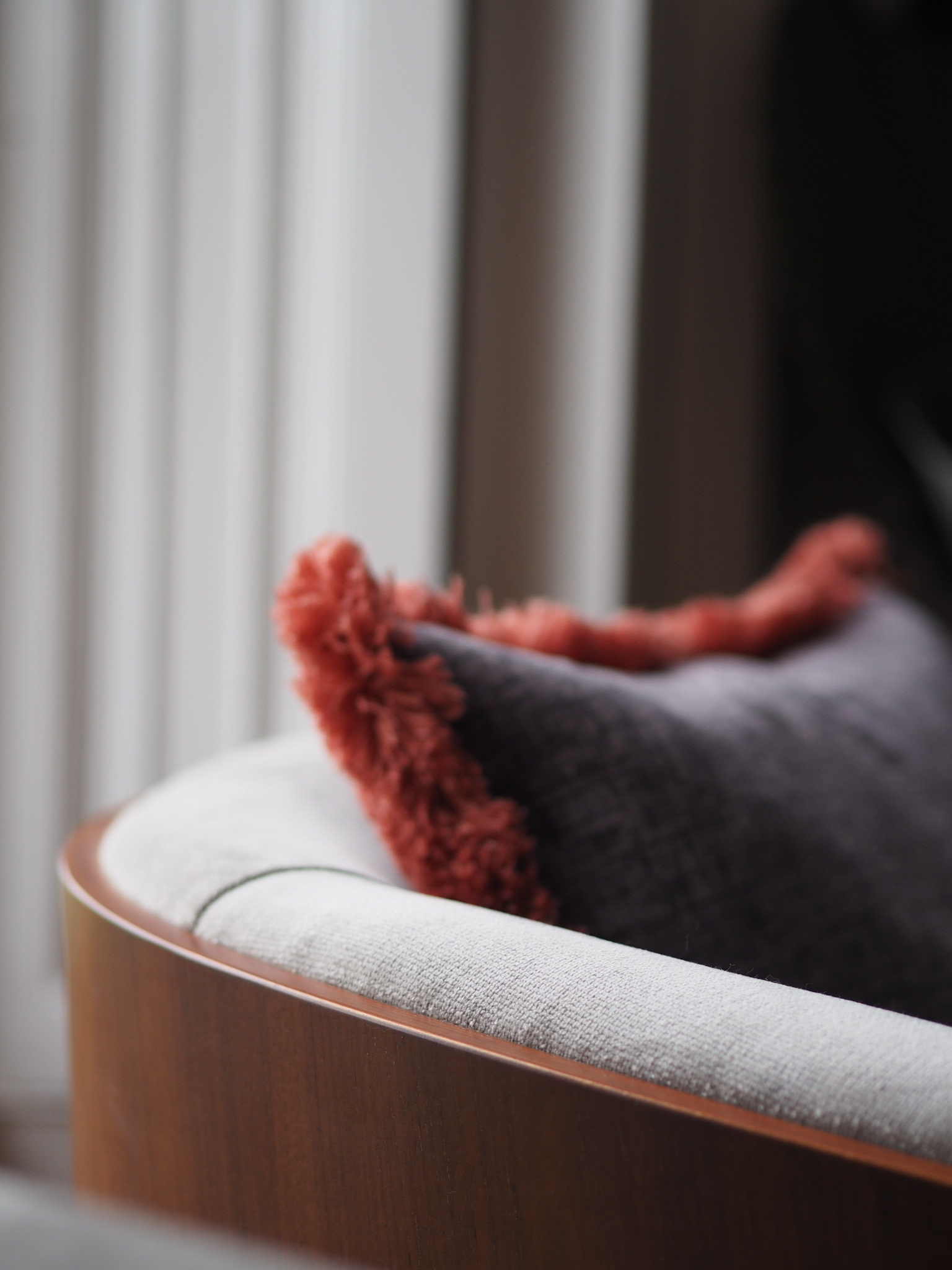
The Colca wool rug from West Elm fitted the space perfectly and is the central focus of the rooms style - I took inspiration from it for the other tonal colours I implemented. Seventies style corded wavy shapes cushions blend in to the look and a faux shearling throw adds texture to the mix.
On the Luther chairs, I used cushions from the Abigail Ahern for Hillarys collection which added a touch of rust.


Went Statement On The Art
I’ve got a lot of gallery walls in my home and I really felt that I wanted to veer out of my comfort zone when I was planning this room. I kind of felt I was moving into overkill territory so wanted a different look for this space. Joe had bought me a large canvas from Surface View five years ago that was my absolute favourite, so I knew that they would have something that would work. They’ve got a huge catalogue of prints that can be made to any size or shape and Desert Rain was the perfect one for the room I was planning. It sits above the sofa and again, is a main focal point for the style of the room.
I added an Anthony Burrill print that I’d had for years, plus a Benjamin Murphy limited edition print that Joe had bought for me last year. Additionally, a mirror was required so I picked a mid century asymmetrical one from West Elm which reflected the space perfectly.


Updated The Rad
The room had been totally held back previously by the shockingly ugly radiator that was there when we bought the house. I switched it for a traditional styled colosseum white radiator from soak.com and my work was done. Perfect.
I’ve said it before and I’ll say it again, changing your radiator to something more attractive is a game changer and completely transforms the look of the room.


Got Techy
We’ve got Sonos throughout our house and have done for years, so it was only natural to add a Sonos Beam beneath the television. It’s Alexa directed and works as both a TV speaker and independently. We can control it from our phones or iPads (we’ve got four speakers downstairs) and play either the same music on all speakers at the same time or have different music on each one. We placed another Sonos speaker that we already had in the opposite corner and cleverly created a surround sound effect. The Samsung The Frame TV was already on the wall so the techy stuff was sorted.


Of all the tech style things that we’ve invested in and brought into our house over the last 15 years, my two favourites have got to be the Sonos system and the Nespresso machine (this is absolutely true). I am now in a position where I work with both of these fab brands - I’d never have thought for a moment when I started posting on Instagram almost three years ago that I’d be able to do so and I feel unbelievably lucky. I never take it for granted. Just saying.
Added Accessories
I’m a massive fan of coffee table books and needed no excuse to stack them up, alongside a central candle holder from West Elm. On the bookshelf, I added some favourite accessories that I’d had for years, together with a few new ones. I used part of my vintage glass collection on the ledge above the doorway.


Greenery - Faux & Real
No room is complete without plants, so I added some trailers to the bookshelf and a few smaller ones to the side and coffee table, including a cactus that I’d picked up last year from my local garden centre that has managed to hang on in there. My large fern continues to survive, despite being moved at least 150 times, as does the cactus pot that I discovered on Gumtree.
I added some large faux leaves from West Elm which I placed in a mid century German vase I’d got from the charity shop on one of my trawls. It’s nice not to have to pray for their survival, tbh.


So that’s about it. As a woman renowned for the gallery wall, this room is a step away from the norm for me and I have to admit, I absolutely love it. The mixed neutral colour scheme means that it’s hugely calming, very retro and feels extremely grown up. The artwork adds serious impact and the soft lines and tones of the furniture that I’ve chosen creates an overall sense of relaxation. My conclusion? It’s a YES from me to neutrals. Bring them on.
