
How I Revamped My Hall, Stairs & Landing
In January, I decided that I was going to revamp my halls, stairs and landing area. I knew that it would be a big job. Although I had painted and wallpapered the ground floor when we moved into the house in 2015, the stairs and landing were untouched. When I say untouched, I mean by an actual paintbrush. The main corridor upstairs houses the children's bedrooms and the walls would have rivalled any dirty protest in the Full Sutton high security prison establishment located just down the road from my very own home. It needed refreshing and making, well, interesting. The corridor was long and empty, the stairwell was devoid of any character and the original picture window from 1760 wasn't being shown off for the beautiful feature that it was.

My original Hall, Stairs & Landing moodboard.
The primary reason that I hadn't conquered the hallway decor prior to this point was the fact that the landing drop is a massive 30ft. It's so high that only Ethan Hunt would be able to reach the top without the aid of full scaffolding and the idea of going up there myself sent me into a decline. Joe was no good to me. We once rode the cable car in Benalmadina and he spent the entire twenty minutes on the verge of tears. Our visit to the Brighton Eye in windy weather a few years ago had the children comforting him for the duration of the ride so I knew immediately that the chances of him reaching the top corners were as likely as Boris Johnson defecting to the Labour Party. But I was worrying needlessly. Miles, The Worlds Best Decorator, came to the rescue and agreed to risk life and limb in the name of interior decor perfection. His only request was that I didn't watch him perform on the ladders in case it put him off. I agreed to sacrifice my Instagram stories for a job well done.
It took a while to create the perfect mood board. There are a few different areas within the space and I wanted to create a focal point in each, whilst also utilising what I already had. I wanted to get the basics right. Initially, I was drawn towards a patterned carpet, but soon realised that if I wanted to incorporate the other items on my board then I needed to keep the bones of the scheme neutral. I'm a transient decorator and knew that in five years time the likelihood of me wanting to revamp again were high, so the essentials of such a high usage space needed to be able to expand with my ideas. Changing flooring and carpet or even wallpaper is a costly job and once it's there, it's there for a while. Plain walls, plain carpet, plain floor. And around these basics I could swap, change, mix and match to my hearts content.
I've always thought that hallways are the equivalent of the poor relation when it comes to decorating your home. They're a space in which we spend a huge amount of our time and yet are really just a thoroughfare, a means to an end. But actually, as a space they are largely ignored and as an interiors obsessive, I took on the challenge of turning my rather bland corridors into something a little more exciting. So what did I do?
Ditched The Downpipe
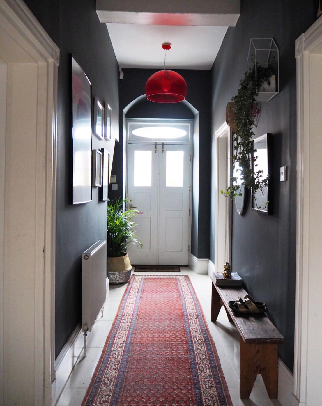
So when we moved in to our house three years ago, I was desperate to whack some grey on the walls. This was when Downpipe sales were off the decor scale and the World and his wife were clamouring to 'go dark'. I matched it with a Cole & Son wallpaper, Deco Palm, and was super happy with it. For at least a year. Until I realised that dark colours weren't my bag and that they definitely didn't make my heart sing (in fact, I wrote a blog on this very subject). From that point on, it was only a matter of time before the hallway got it and my plans were laid. I decided to go soft white, Blanc De Blanc by Valspar. I've used this colour before and it's hard wearing, easy to put on and most importantly, after seven days you can scrub it with a brillo pad.
I knew this was the right decision when two days after the new colour went on, a random juice carton was squirted across the entrance hall. In a high footfall area such as a hallway, there's simply no point in going for something that is not completely scrubbable. Especially with two boys who play football every day of the week and a 16 year old daughter who has regular house parties. The same colour went across the front hall and up the stairs, removing all the handprints which had been adorning my walls for the previous two years. The hall, stairs and landing were whitewashed. As stated above, it was far better for Miles to take that risk than myself. Which he did, gracefully. Everyone needs a Miles.
Before: Rear Hallway

After: Rear Hallway
Pinked Up The Front Door
I'd been inspired for months by the home of Elsie Larsson of A Beautiful Mess blog, in particular her pale pink interior front door. I've made mistakes in the past in my home by rushing to add trend colours to my walls and I've learned from this that I'm always better to add a hint of a trend rather than go the whole shebang. My living room had already had the pale pink treatment last year and it had lasted two weeks before I'd realised that my love of blush didn't extend to being surrounded in a huge womb like cocoon of pinkness. It wasn't a quick job to paint it out though so since that trauma, I've thought more carefully before I make such decisions.
Anyway, I figured that painting a door was a pretty simple job and also aligned with my theory that trends should be brought into your home only in small amounts so as not to take away or be detrimental to your core style. I picked Valspar Rose Quartz which is a Pantone colour and it was perfect - both the internal of the front and the back door were transformed. Plus, if I change my mind down the line (yes, very likely), then it would be a simple job to bring in a different colour. The Palm Springs look in a Yorkshire village. Perfect.
Before: Front Hallway

After: Front Hallway
Created A Selfie Central
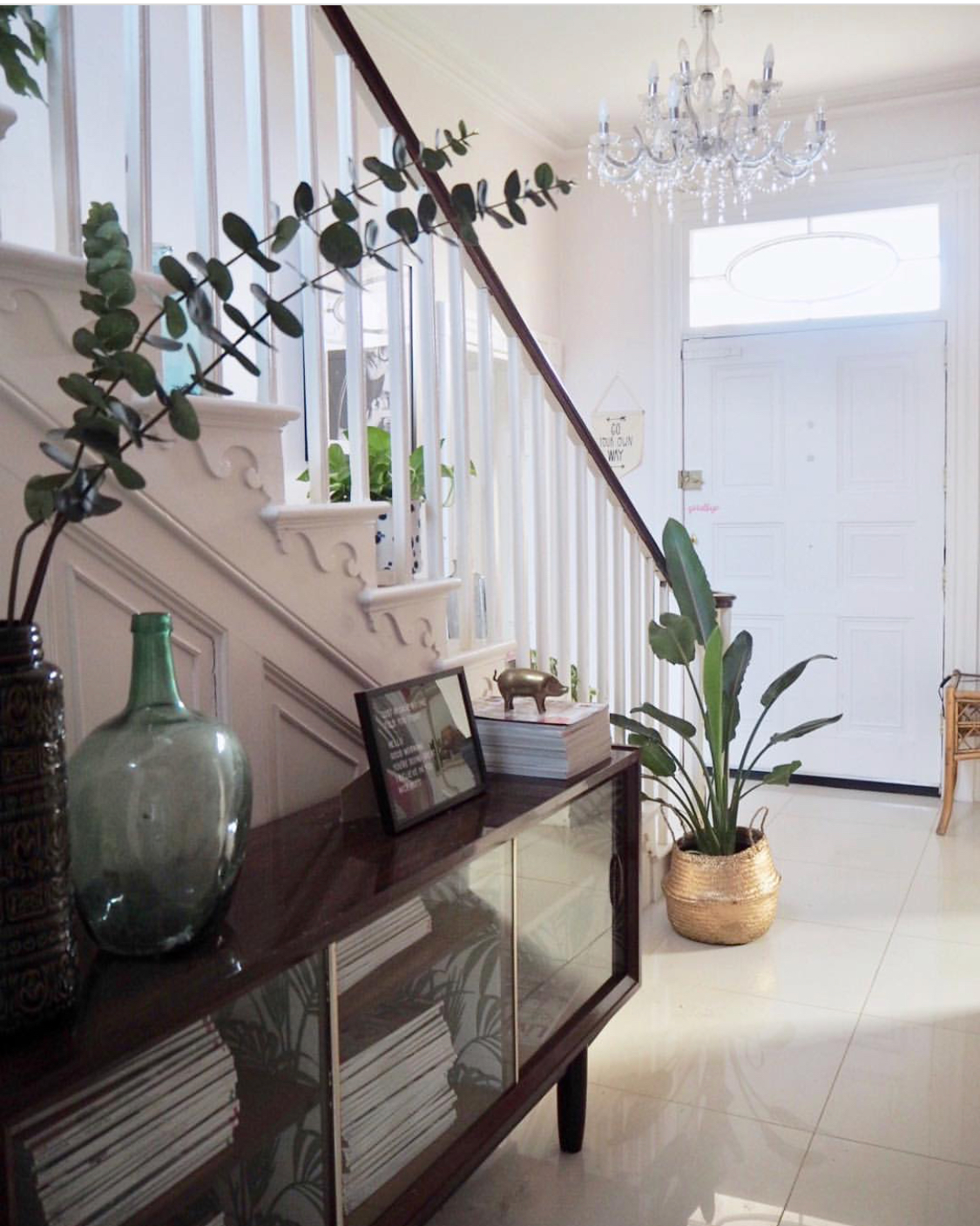
I wanted the hallway to have a console area rather than the long bench that was there before so I was pleasantly surprised when I realised that the £5 upcycled sideboard that I'd picked up a few years ago fitted perfectly. I added a huge circular mirror from West Elm. It's the perfect selfie mirror and makes a huge impact when you walk into the hallway. The sideboard is storage for my old interiors magazines and is an excellent hallway addition with plenty of space on the top for plants and books, a good contrast to the white walls.

Before: Rear Hallway

After: Rear Hallway
Removed The Eyesore Rads
One of my massive issues with our house is the fact that when it was originally renovated, the builder literally must have gone into the shop and asked for the cheapest, most shit radiators that were available. His wishes were fulfilled as I couldn't have asked for anything less attractive than what was on our walls. To be honest, it didn't really matter in most rooms but in the main thoroughfare of the hall and landing, they were a real eyesore.
Soak.com came to my rescue. The three flimsy, dodgy and definitely non Insta worthy radiators in the space were replaced with traditional style panels. There's one on the landing, one in the front hallway and one in the back hallway and they've transformed the space. I couldn't love Soak.com any more than I do.

Top Landing

Front Hallway
Created My Biggest Gallery Wall Ever
I decided that in the back hallway, I would keep the artwork simple. I added a framed David Hockney photograph from King & McGaw opposite the mirror and decided that was enough. However, my plans for the staircase couldn't have been more different. I'd been collating prints for ages and added to them regularly with vintage and old favourites. I took the gallery wall from the top of the staircase to the very bottom, working upwards from the floor. The overall look is super effective and I wrote a blog about how I did it after receiving hundreds of questions about my plans.
I added a smaller gallery wall on the corridor leading to the children's room. Again, I only did it on one side of the wall - the opposite side I left plain. I really like the idea of every area of my home having a point of interest but it's important not to overdo it. I know I'm prone to this, so I make sure I keep the rest of it simple.

My staircase gallery wall.

The corridor leading to the children's rooms.
Put Up Shelves (Well, Got Martin The Handyman To Put Up Shelves)
There was a dead area in the hall, a vestibule section where double doors lead to the courtyard. I realised this was the perfect place to add three shelves - they'd be hidden when you entered the house but would appear as you walked around the corner, which I quite liked the idea of. I bought some made to measure wooden scaffold shelves from Bear & Wolf with matching brackets. They were ideal for the space and are perfectly suited to a plant hospital, AKA where I keep all my dead and dying plants of which there are many.
I also wanted shelving to display my coloured glass collection on the landing. Taking inspiration from the Jonathan Adler designed reception of the Parker Palm Springs Hotel, I bought picture shelves from B&Q (currently being discontinued so only £6 each) and ran four of them along the landing wall in a stretch. This area is next to a huge picture window so it's perfect for catching the light. I added the glass in colour coded order and it looks lovely.

The plant hospital. Where plants go to die.

My Jonathan Adler inspired glass display.
Kept It Simple
A lovely company called Eye 4 Design Upholstery asked me if I would like a bench upholstered in a fabric of my choice, so I chose Mono Giraffe by the talented Anna Hayman which was the perfect match. I moved an upcycled glass cabinet next to the main front door - it's filled with vintage glass so was a good contrast to the space. Again, I wanted to keep the main area fairly simple so I used an old wooden school bench along the base of the stairwell.
The upstairs landing was cleared of furniture and I added a simple scaffold bench, again by Bear & Wolf, next to the family bathroom. By keeping the spaces as free of clutter as possible, all of your attention is focused on the walls.

Beautiful bench by Eye 4 Design Upholstery in Anna Hayman fabric.

Bench, Bear & Wolf; Cushion, Bamaluz Home; Print, Gayle Mansfield Designs
Changed The Carpet
When we moved into the house, the carpet was pale cream. Yes, pale cream. I'm sure the builder had a reason for doing so in a five bedroomed family home but I will never know what that was. Madness. Anyway, within a week of moving in the landing area had already been stained and I was constantly scrubbing the stairs. One day, in a fit of pique, I ripped up all the carpets to the absolute horror of my family. Thus ensued six solid months of complaints from the children and cries of pain as they trod on exposed gripper rods, not to mention the noise the dog and the cat made running up the exposed stairs which was akin to an elephant stampede.
Axminster came to the rescue and provided me with a hard wearing, natural textured carpet - Simply Natural in Grosgrain Basalt - which was perfect for the space. Due to the fact the previous owner had decided it was perfectly acceptable to cable wiring up the 280 year old staircase, we couldn't have a runner anywhere but up the main staircase but this actually works really well and I'm super happy with it. As are my children.

The view from the top landing of the new runner.

Simply the nicest runner I've ever had.
Added Gorgeous Accessories
I already owned a vintage runner that I'd picked up in the charity shop last year for £10 but I wanted another for the main hallway. I'd searched around but hadn't found anything that fitted the bill colourwise. The London Persian Rug Company came to my rescue and sent me possibly the most beautiful runner I had ever seen which looked like it was made for my home. It blends perfectly with the Rose Quartz front door - I love a pink and red combo.
I needed a mirror in the front hallway and the Biba mirror from House Of Fraser was perfect opposite the stairway. It's a great size and the brass looks amazing against the flooring. Finally, a selection of gorgeous pots and vases from Att Pynta in subtle tones added interest to the spaces.

The most beautiful runner ever from The London Persian Rug Company.

Gorgeous pots and vases from Att Pynta.

The perfect hallway mirror from Biba at House Of Fraser.
Made A Statement With Lighting
I had huge Kartell fly lamps in the hallway and I decided to replace these with something a little simpler. I found white globe lighting in Habitat which was unobtrusive and yet looked super cool. The main hallway was a different matter - it needed something with a serious statement to make. Original BTC stepped in with the Cranton pendant, literally the light of my dreams. Handmade in bone china, it looks beautiful both off and on, something that is always a huge priority when you are looking at central lighting. A lighting dream come true and a statement light to end all statement lights.
But what about the landing light? The drop is over 30ft and untenable without a scaffold tower so I'm going to be doing that within the next month or so. With the help of Wendy from Homeplace, I've sourced and purchased a vintage 1980's chandelier which was previously in a Church and it's going to look fab. And luckily, Miles The Worlds Best Decorator has a brother, Christian, AKA The Worlds Best Electrician so I don't need to risk my own life.

The beautiful Cranton pendant from Original BTC.

The Cranton pendant looks good from all angles.
Bought My Own Birthday Present
When I met Joe 19 years ago, we had a favourite song. Everyone has a favourite song that reminds them of when they met, yes? Ours was Sixpence None The Richer - Kiss Me. Whether or not Joe would even remember this if I didn't drill it into him is another matter, but to me it always reminds me of the fateful night we met in Break For The Border on Argyle Street, the home of the tequila holster toting waitress, flaming Sambucas and a drunk dancing hot spot post 11pm. Anyway, I seriously loved that song so I asked Bag & Bones to custom make me the words in neon so that Joe could present it to me as a birthday present.
I regularly chose my own birthday presents - on one of the few occasions that I allowed him to make a decision on what to give me he arrived home with Duncan Bannatyne toner and cleanser (who knew?) and a bottle of Beyonce Heat. Those of you who are eagle eyed will immediately recognise that these items can all be obtained in Tesco's during a lunch hour. And there lies my present buying logic. 'Kiss Me Beneath The Milky Twilight' arrived when my Mum and brother were visiting and they immediately announced it was a pornographic phrase. Pornographic or not, it now resides in my hallway and looks the dogs bollocks. Neon perfection.

The best neon ever. In my opinion, of course.

Buddy photobombing.
Warmed Up The Floor
The icing on the cake of my revamp was the floor. We had large cream tiles which, whilst they were quite effective, were absolutely freezing on the feet and also showed up tumbleweed like no one's business. I'll never win Housewife Of The Year Award but even when I do get the Henry Hoover out, within twenty minutes it looks as if I hadn't bothered. Both of my son's play football and are constantly kicking off boots and scattering small astro turf balls like rabbit droppings all over the gleaming whiteness. I'd decided enough was enough.
Amtico screeded directly on to the tiles and laid Walnut planks which matched the wooden floors in both living rooms leading off. A total revelation. Not only is the floor much warmer to walk on, it also gives texture to the area and makes it feel much cosier, which is important in a big space. Super happy and even happier that I don't need to get the hoover out as much.

Literally the perfect walnut floor from Amtico.

Practical and warm, the Amtico flooring is ideal for the space.
So that's it. The longest revamp in the history of revamps. It's taken a while, but I can't tell you how happy I am with the result. I stuck to my mood board and it's all come together really well, although I hadn't really anticipated quite how much work it was all going to be, if I'm being honest. The changes I've made, especially to the upstairs corridors, have created focal points where previously there were none and the new carpet and flooring make the spaces feel so much warmer and welcoming.
And the white? Well, you can't beat a neutral. Once again, my heart is singing when I walk in the door and with the addition of our neon song of memories, so am I. In a non pornographic way, of course.