
A Sitting Room Update: How Paint & Paper Transformed My Room
The sitting room in our home is the smallest living space. More of a ‘snug’ (although I cannot lie, I hate that word - for me, it falls into the same category as ‘nook’, ‘supper’, ‘quirky’, ‘moist’, ‘trendy’ and being addressed as ‘hun’, all of which make me feel unfeasibly irritated), it’s also, ironically, the coldest room in the house. This is mostly due to the fact that during Season 1 of Revamp Restyle Reveal, I whipped up the carpet and sanded the floor myself wearing a pair of Havianias and acrylic nails. The flip flops and the manicure lasted about five minutes but another major fail was that I forgot that underneath the room was the cellar, a two room space blessed with arctic conditions due to lack of insulation. Not only did the sand go through into the cellar, dusting everything in it with brown snow, but the lack of carpet and underlay meant that lounging in the sitting room was akin to sitting in a fridge. As a result, we generally decamped to the living room for Netflix watching (no chilling), a warmer room that was more spacious and much cosier.

The room before I dismantled it. Nothing really gelled.
Another issue was that I’d stripped the majority of the wall of prints when I was decorating the dining room. As a result, there were several gaps and I’d fallen out of love with a few of the prints that remained. It was a ‘middling’ room without any real focused style to it. I’d also decided that as the dining room and hallway were focused on gallery walls, I needed to think a bit about how this room should look. I didn't want to do another gallery wall (I’d recently used statement art in the living room from Surface View, a large desert print that was really impactful) so I started to think about how I could make this room stand out from the crowd. The answer, I decided, was wallpaper.
I’d used wallpaper before, in my hallway, dining room and living room, but only on one or two walls. I was, it has to be said, kind of over the feature wall. For Season 2 of Revamp Restyle Reveal, I’d wallpapered my dressing room in full, including the wardrobe doors, and loved the effect it gave. Who wouldn’t want to be surrounded by pink fluffy clouds and giant cranes whilst their putting their make up on? Don't answer that. Anyway, I decided that a fully wallpapered room would be perfect for the space. One, it would make the room feel cocooned and cosy. Two, the wallpaper would limit the necessity for artwork as it would be a work of art in itself. And finally, it would feel completely different from the rest of the house and I quite liked the idea of trying something new. I’m a very transient decorator, I enjoy a change of scenery. I posted a story this week regrammed from the American interior stylist, Liz Kamural, in which she said, ‘I dislike half of which I’ve ever created. But that’s part of the process. Experiment and grow’. If you don’t try it, how will you ever know? I figured it was worth the risk.
So what did I do to update the room?

Wallpapered The Walls
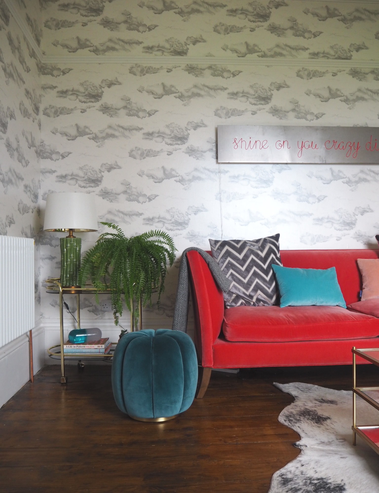
I’d worked with Harlequin wallpapers before - they were responsible, in fact, for my flying cranes - and I knew that they were great quality. I chose Nuvola in Ink/Mica - tiny dots that created skies and clouds, a wide width wallpaper that was perfect for the space. The colour was perfect, a neutral background with a darker grey on top, an easy pattern for teaming with solid colour. I took it above the picture rail to heighten the ceiling. The room has a large Georgian window complete with original shutters and the paper framed it perfectly.
Repainted The Bookshelves
There are bookshelves either side of the fireplace which I’d previously painted in a teal shade, Reading Room by Earthborn. I loved the colour, but needed to blend the shelves with the wallpaper so I chose a very dark grey from Johnstones Paint (as dark as Off Black by Farrow & Ball) to match. This colour worked in several ways. It was perfect for the wallpaper, made the television less obvious and also cleverly hid the vast amount of equipment that comes with having a husband who is obsessed with technical and media items. Such items that come with the ‘benefits’ of having a 60 inch flatscreen television include, but are not restricted to, Sky Plus box, Playstation 4, full Sonos system and a surround sound speaker. These items are now virtually invisible against the dark grey. Winning.
Updated The Radiator
As mentioned above, the room was cold. This wasn’t helped by a dodgy and undersized radiator which at maximum heat was equivalent to standing next to a piece of toast. I decided a bigger one was required so I installed one from soak.com which matched the rest of the downstairs radiators - a white triple column traditional colosseum style which was perfect for the style of the house. Although there is a fireplace in this room, we don’t use it so it was really important that this was able to warm up the space. Job done.
Shopped My Home
So furniture wise, I’d recently received a four seater Descartes sofa from sofa.com in a Dusty Rose velvet. Super comfy, I knew that it would look fabulous against the wallpaper so I teamed it with an olive green velvet Chesterfield that I already owned. I already had a gold and glass Terrace coffee table from West Elm which was perfect for the centre of the room, plus a small mango wood side table that I’d had for a while. I added the vintage with a gold and glass tea trolley (picked up a few years ago for £10 from the charity shop) which worked well with the rest of the furniture. A teal velvet Sofia footstool from Soho Home was a perfect match.
Added The Texture
I had a huge grey and white cowhide that I’d picked up on eBay about twelve years ago - it was a great contrast to the traditional style of the sofas. Two Monroe moss green velvet cushions from Soho Home worked well on the Chesterfield and I added a few cocktail cushions from Luxe39 combined with some simple neutral colours to the pink sofa. Plenty of throws gave the room a cosy feel and were also an essential (remember the drafty floorboards?).

Limited The Art
I wanted to keep the walls simple - I’m not a big fan of the print on print trend to be honest - so I used my favourite neon from Light Up North above the sofa. It was originally in the kitchen, but I thought it was a good contrast, again, to the traditional feel of the room. A small limited edition print from Pure Evil went left of the window and a couple of matador plates I’d picked up at a charity shop years ago were perfect for the other side. That was enough. A gallery wall free zone.
Brought In The Plants
A few years ago, I picked up a large palm from my local garden centre that had been languishing in their coffee shop for some time. It was quite battered but the price reflected that and it’s been hanging on in there in the dining room ever since. Anyway, it was looking seriously droopy so I cut off some of the bigger fronds which were browning at the edges. Now, I’m not claiming to be Yorks answer to Charlie Dimmock but it absolutely rejuvenated it - it almost immediately started sprouting new leaves and looks so much healthier. It may be a temporary reprieve for the poor plant but I’m quite impressed. I also brought in my large fern and a couple of other small ones. Keep praying for them.
Accessorised
I did what I’m always instructing people to do on my blog and I did an accessory cull. I worked out what I still loved, took what I no longer loved to the charity shop and added some pieces I’d always liked by shopping my home. I couldn’t resist colour coding my bookshelf (I know, I’ll never tire of this look) and picked out my favourite books to stack on the coffee table. A Tatra hurricane lamp from LSA International completed the look. From a lighting point of view, I used two huge bamboo lamps that I bought years ago from Homesense and added a small Inca side lamp from Argos Home that fitted nicely on the shelves.


I have to admit that I’m really pleased with the way the room has worked. The wallpaper makes a real statement yet also makes the space feel warmer and more conducive to lounging. It’s quite traditional, but I think the juxtaposition of the more modern pieces such as the hide rug and the pink neon gives it a bit of an edge. And I’d definitely recommend dark shelving for hiding all the technical gadgetry! I’m really happy that I decided to take the risk with something new. Right, on to the next room…
